Start Here
If you've just purchased the Coach X Webflow Ecommerce Template and are looking for a quick guide on how to start editing it, start here.
Getting Started
Thank you for purchasing the Coach X template. In this brief guide, we cover all the basics of how to edit key elements (such as colors, fonts, CMS content, etc.) in the Coach X Webflow template.
If you're not very familiar with Webflow, we highly recommend taking the Webflow 101 Crash Course from Webflow University, as it will teach you all the basics you need to get started.
Styling
Let's get started with styling the template
Colors
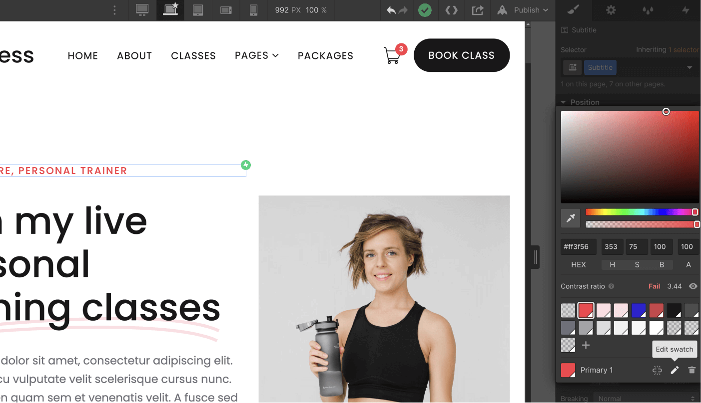
The Coach X template is built using color swatches, which means you can easily edit a color swatch to update it site-wide.
To do this, simply go to the Style tab in the right sidebar, scroll down to the Colors section under Typography, and click on the color to view all color swatches and edit them—the changes will be applied site-wide to the color of your choice.
Fonts
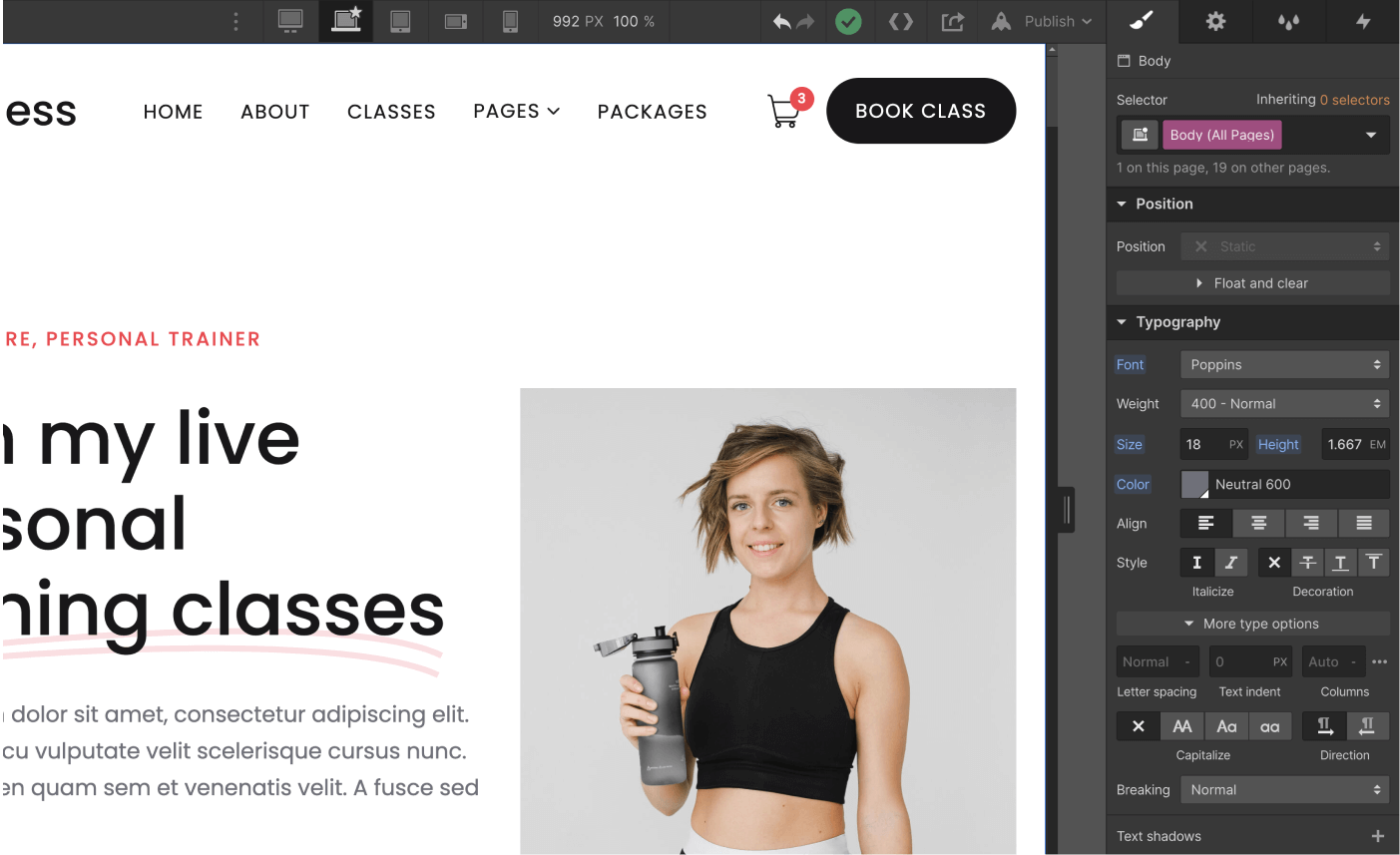
The Coach X template uses a single font site-wide, and it's applied to the " Body (All Pages)" selector, which means you can easily update the font across the entire site with a single click.
On any page, simply click the orange selector icon in the top-right corner of the Style tab, then select "Body (All Pages)." Once you've done that, you can go to the Typography section below and change the font to one that matches your brand.
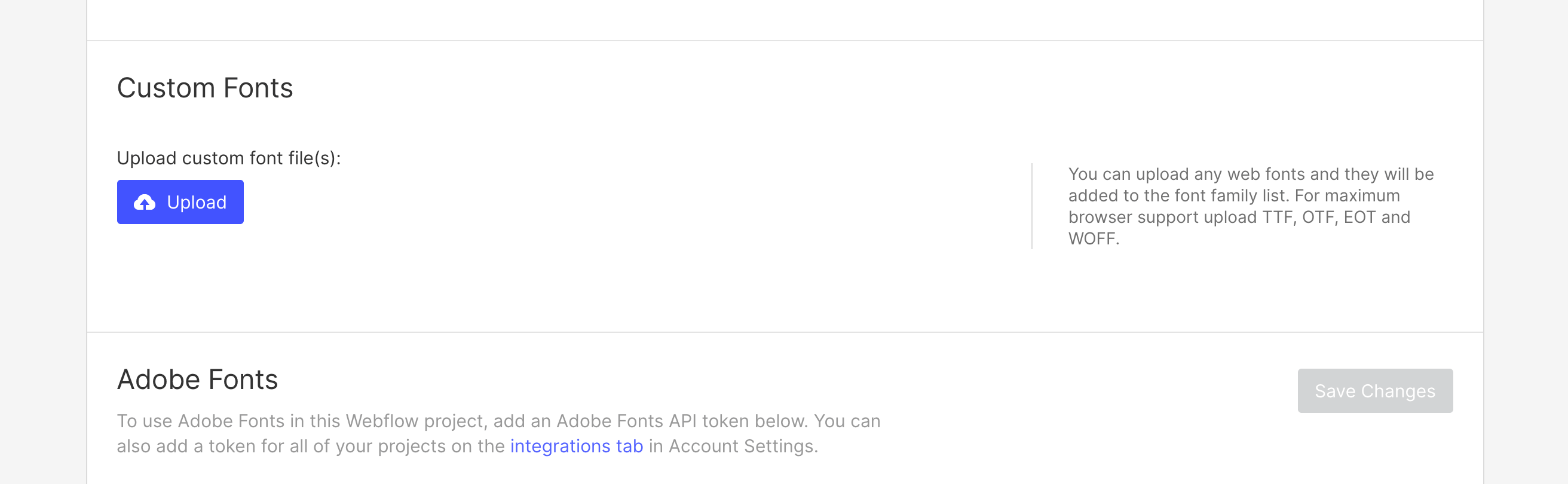
If you need a custom or premium font that isn't available on Webflow, you can always go to Project Settings > Fonts to upload custom fonts or connect your Adobe Fonts account.
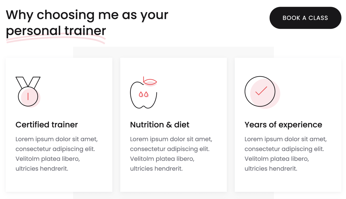
Graphics & Icons
Some icons or graphics in the template are standard images/graphics, so you'll notice that when you update all the colors, these will still retain the template's default color.
This happens because these graphics are images (PNG, JPG, SVG, etc.), so updating the Webflow CSS (styling) won't affect them. If you'd like to reuse these graphics, you can always download them and edit them using any design software (e.g., Photoshop, Illustrator, Sketch, Figma, etc.), or directly upload your own images or graphics that match your brand.
Editing Pages
Now it's time to move on to the next steps for editing your website pages. Generally, there are two types of content that will be edited, which are as follows.
Static Content
Static content refers to all content that is not CMS-based, meaning it is not dynamic (such as a blog post, for example).
You can easily identify all this content because it appears in gray in the left sidebar Navigator, and a blue border appears when you click or hover over it.
If you want to edit this type of content, just double-click it, and you'll be able to type directly in the field.
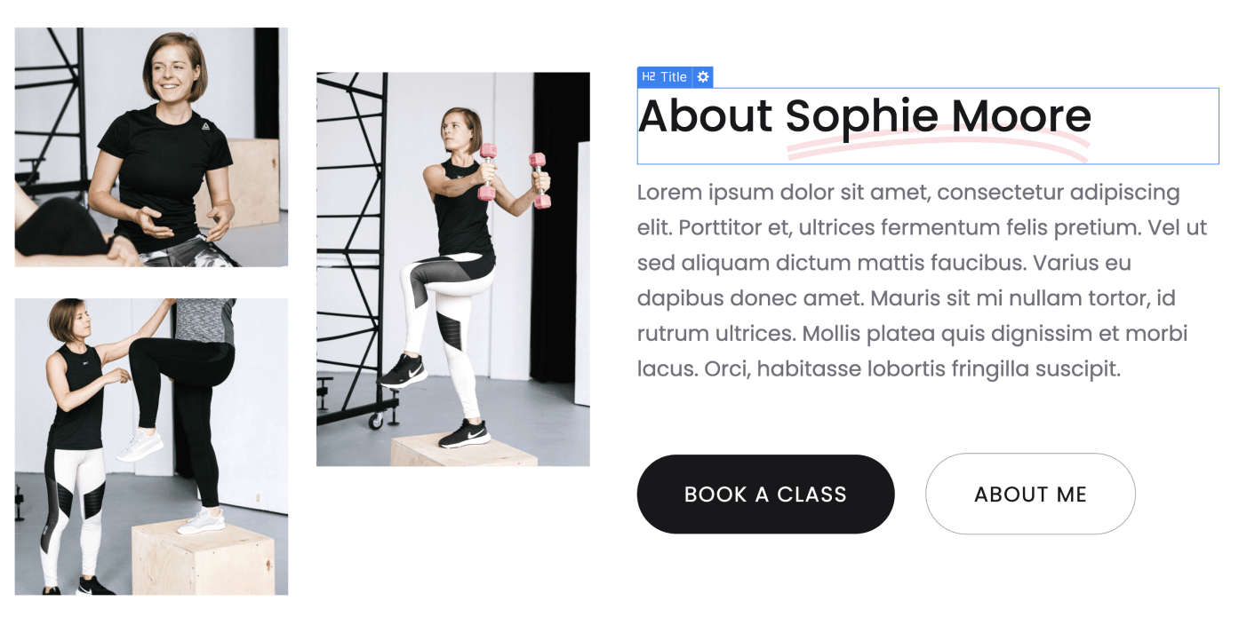
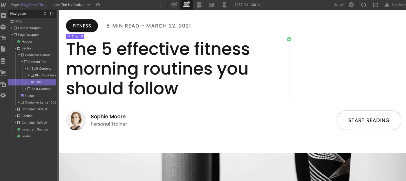
Dynamic Content (CMS)
Dynamic Content refers to all content that is dynamic and will be automatically generated based on the content added in the CMS section in the left sidebar (just below the Pages icon).
You can easily spot all of this because it appears in purple in the left sidebar Navigator, and a purple border appears when you click or hover over it.
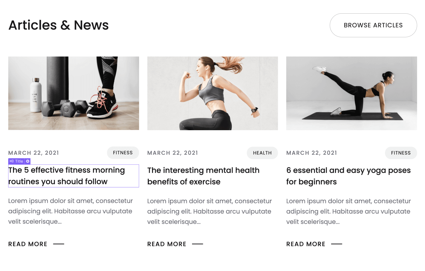
This content should be updated directly in the CMS section. This is designed to make it very easy for you to update it, as it will likely need to be updated frequently (for example, when adding a new blog post).
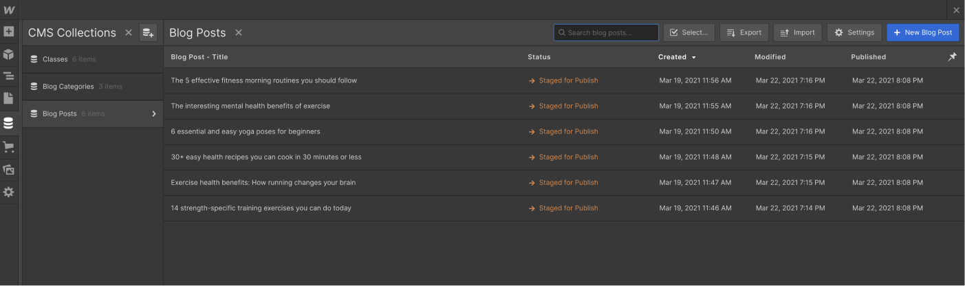
Also, if you want to edit a fully auto-generated CMS page (such as a blog post), you'll find this page available for editing at the bottom of every page in the "Pages" section of the left sidebar.
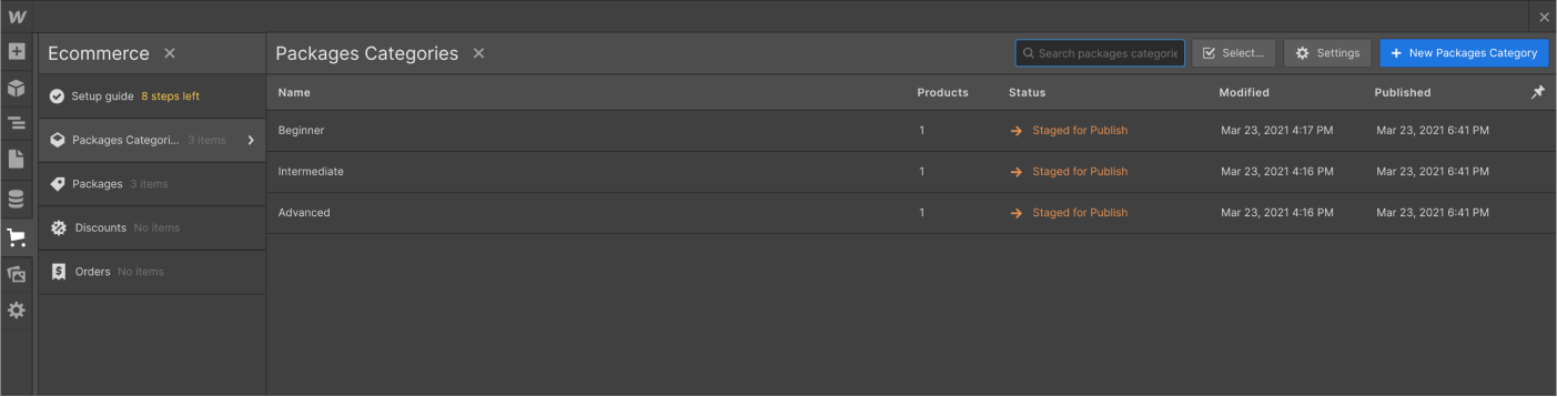
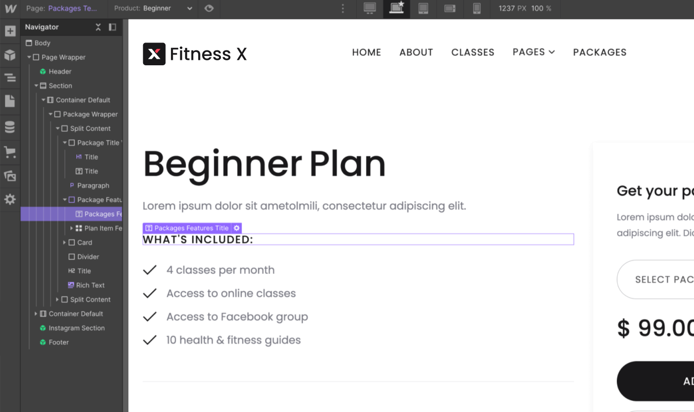
Products (e-commerce)
Products or e-commerce content function similarly to dynamic CMS content; however, this feature is designed exclusively for e-commerce products.
You can identify e-commerce content in a similar way to CMS content, since it also appears in purple in the left sidebar Navigator and has a purple border when you click or hover over it.
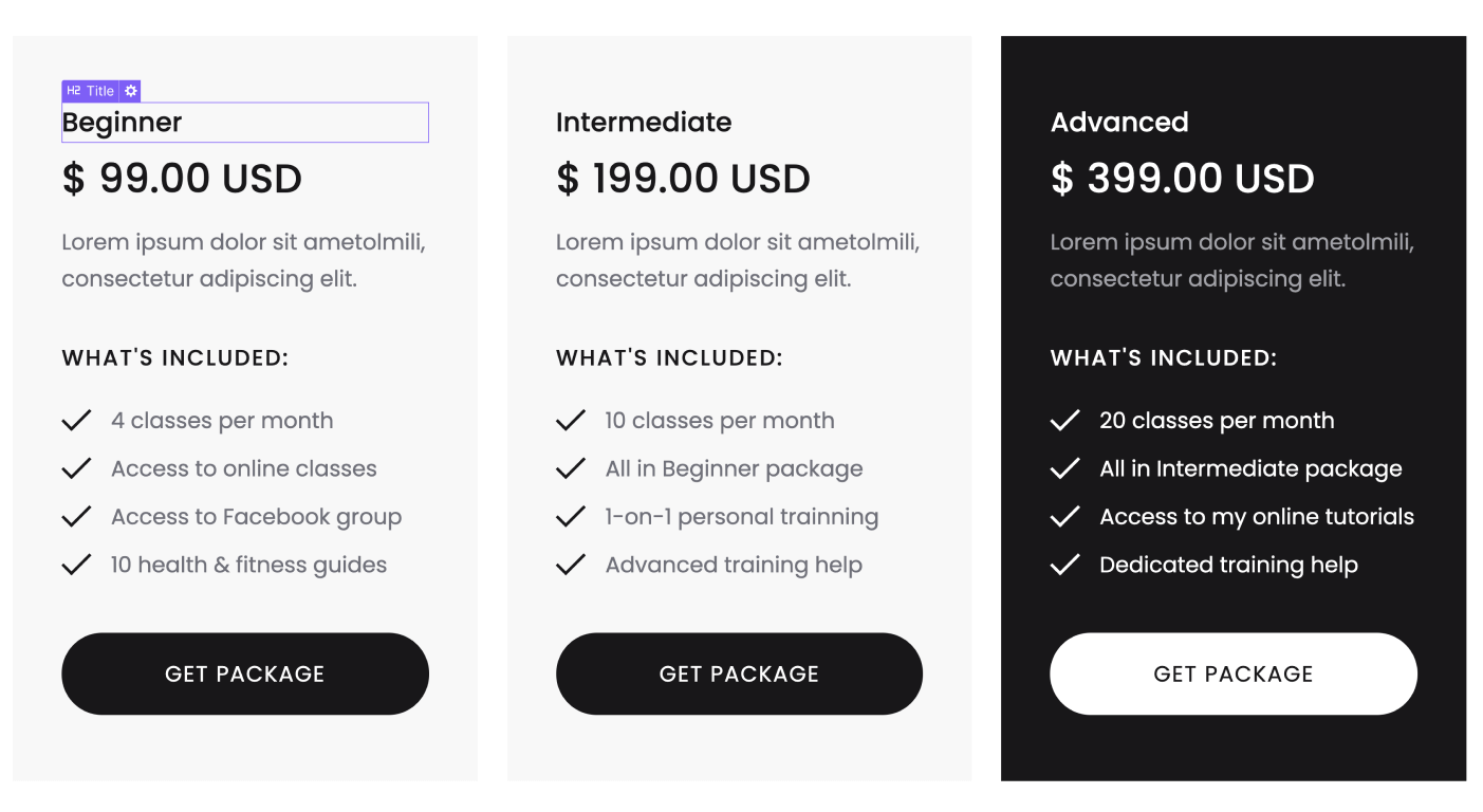
This content should be updated directly in the "eCommerce" tab in the left sidebar. This is designed to make it very easy for you to update it, as it will likely need to be updated frequently (for example, to change a product price or add more stock).
Also, if you want to edit the automatically generated product e-commerce page, you'll find the edit option near the bottom of every page, just above the CMS collection pages.
Useful Notes
In addition to the basic explanation we provided above, here are a few tips and how-to guides based on the most common questions we receive.
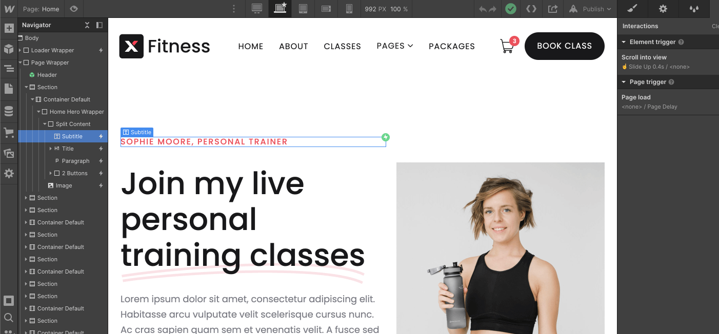
Interactions
If you want to edit any Interaction template (such as removing an appearance effect), you can easily identify elements that have interactions, as they are marked with a small Interactions icon (a small lightning bolt) in the left sidebar Navigator.
If you click this small Interactions icon, you will open the Interactions tab in the right sidebar for this element, where you can edit the interaction.
Mobile or Tablet View
Whenever you make a change (for example, when you create a new section design), it's a good idea to go to the top navigation bar in your Viewport and see how it looks on tablets and mobile devices.
If you only update a template section with new text or images and don't delete any template classes, this shouldn't be necessary; however, if you make more extensive customizations to the template, edit classes, or create new sections, it's always a good idea to regularly check the mobile and tablet views to ensure everything looks perfect.
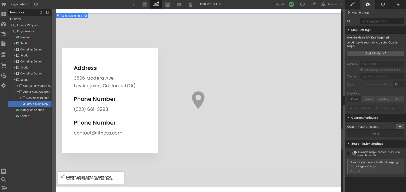
About | Site Map
To use the map on the About page, you need to use the Google Maps API. Please obtain an API key there, and once you have it, simply enter your address, select the map type, and set the zoom level.
Editing Meta Title, Description, and Featured Image
If you'd like to customize the title, description, and image that appear when you share your website on social media (such as Facebook, Twitter, etc.), simply go to the "Pages" section in the left sidebar, click the small settings icon for the page you want to customize, and all the relevant settings will appear.
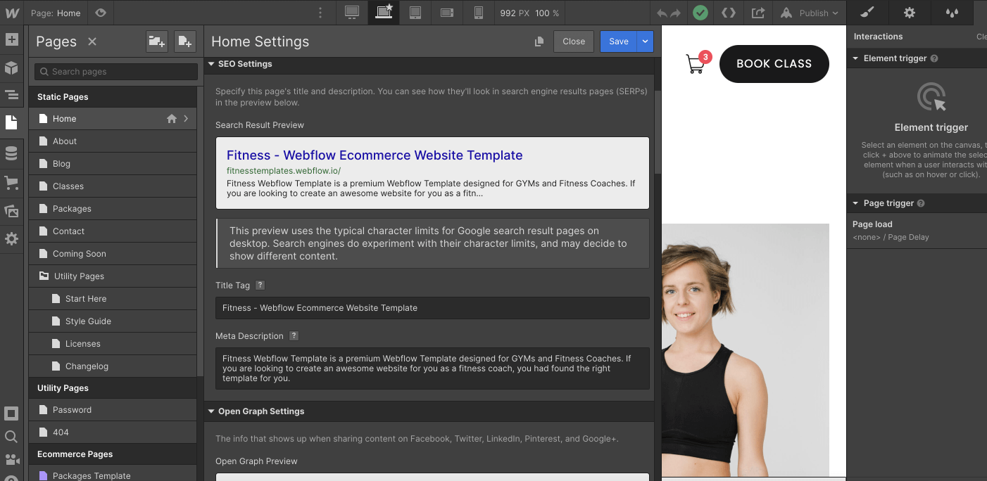
Please note that it is important to change this on a page-by-page basis.
Backups
If something goes wrong—for example, if you're not happy with the direction the website is taking, if you deleted some critical classes needed to make the template look good, or if you just want to revert to a previous version for any reason—you can always go to the Backups section.
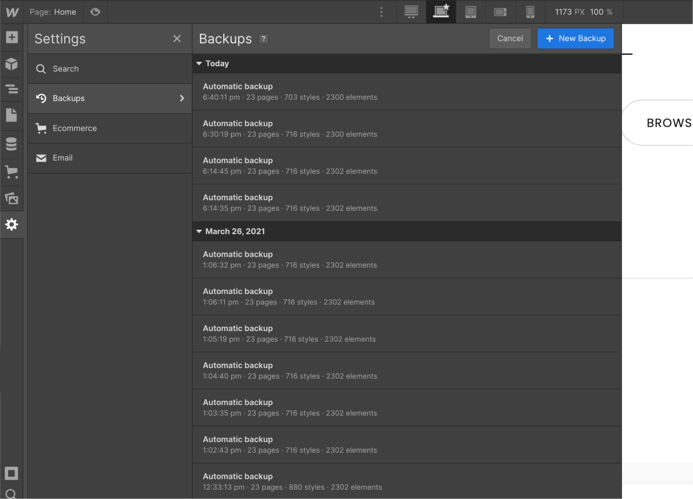
You can find it in the Settings section in the left sidebar, where you can view all your automatic and manual backups. Restoring from an old backup is just a click away.
Coach X Webflow Template Support
As you can see above, Coach X was built on Webflow using best practices to make it very easy for you to edit the template and customize it to your needs.
However, if you ever encounter any issues, need help, or just want to say hi, feel free to email us at coachx@brixtemplates.com — We’ll be happy to assist you.
Custom Design & Development
On the other hand, if you’re looking for help creating a unique and customized version of Coach X, or simply an amazing website designed and developed from scratch on Webflow, feel free to contact our Webflow Design & Development Agency by clicking here. The amazing team behind the Coach X Webflow Template is here to help you.